Features a detailed and vibrant layout for an interview with Lana Del Rey. Showcases skills in magazine design and editorial layout, using a sophisticated colour palette and carefully chosen typography to create a professional and engaging article. The design includes a prominent image of Lana Del Rey, high-quality visuals, and strategically placed pull quotes to enhance the narrative. The layout balances text and images, with clean organization and dynamic elements that draw the reader’s attention.
Features a comprehensive layout that highlights articles and contributions from self-identified women. Showcases skills in layout design, content curation, and visual storytelling, using a vibrant and cohesive colour scheme to enhance reader engagement. The clean, professional design balances text with high-quality images and graphics, ensuring a visually appealing and easy-to-navigate publication. Typography is thoughtfully selected to differentiate titles, subtitles, and body text, maintaining readability.
Features a clean and professional layout design that highlights company news, employee spotlights, training and development opportunities, health and wellness tips, and a message from the CEO. Showcases skills in layout design and content organization, using a cohesive colour scheme and clear typography to ensure readability and engagement. High-quality images and graphics enhance the visual appeal, while strategically placed sections make the newsletter easy to navigate.
Features a page from the University of Toronto’s magazine. Showcases skills in layout design and editing, with a focus on creating visually appealing and readable content. The page includes a vibrant illustration and well-organized text, using a mix of typography to highlight quotes and important information. The design ensures a balanced composition with a clear hierarchy of content.


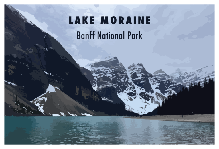
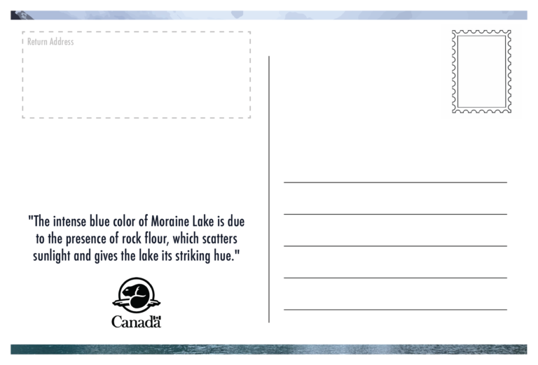
Features a detailed illustration of Lake Moraine on the front, paired with clean and bold typography. The reverse side offers ample space for personal messages, a return address section, and room for postage, blending both aesthetic appeal and functional design. This postcard highlights skills in layout and illustration, providing a visually striking yet practical memento of Banff National Park.