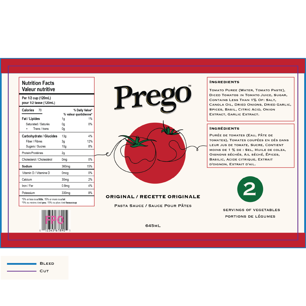
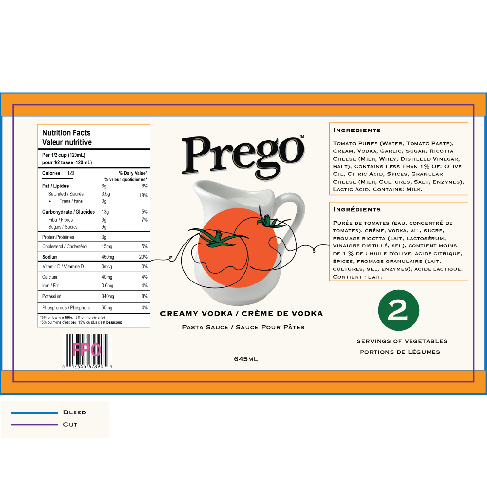
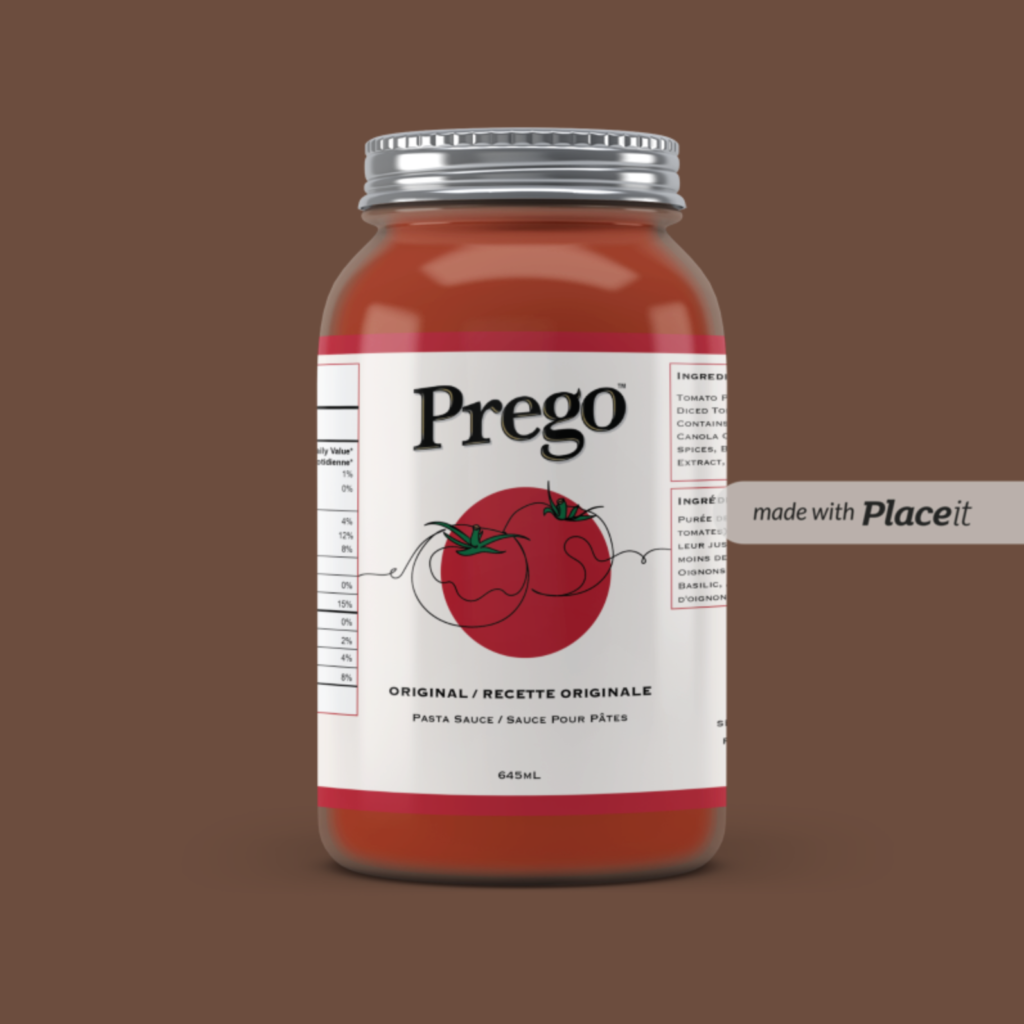
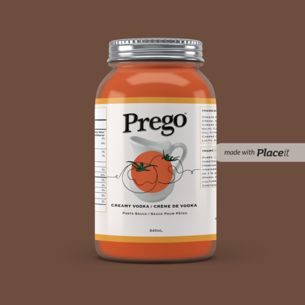
Features two package designs for Creamy Vodka and Original flavors. Showcases skills in package design and branding with distinct colour schemes—creamy orange for Creamy Vodka and classic red for Original. The clean layout includes clear sections for nutrition facts, ingredients, and serving information, using bold fonts for readability. Illustrations of tomatoes and a jug add creativity and visual interest. The designs include dyelines for precise cutting and folding, ensuring accurate label production.
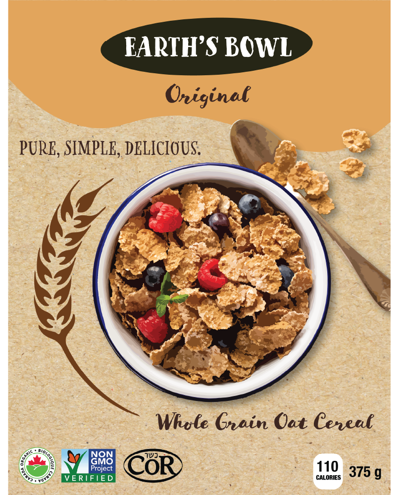
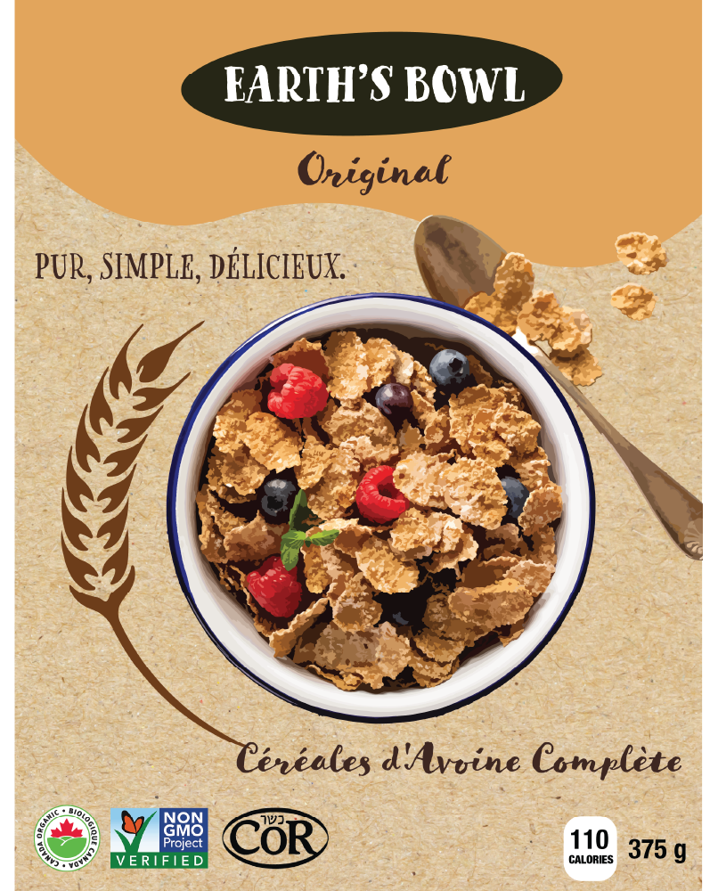
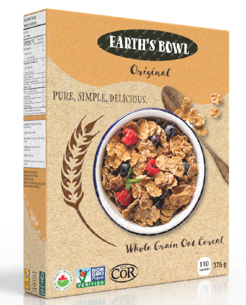
Features a bilingual layout with an organic, natural look. Showcases skills in earthy colors and rustic textures. The front includes the product name, cereal bowl image, and health icons (organic, non-GMO). Sides display nutritional facts, ingredients, and “Our Story.” The top has a “Best Before” date, and the bottom shows the barcode and certification icons. Rendered in 3D with Boxshot 5 for a realistic shelf view, ensuring functionality and visual appeal.
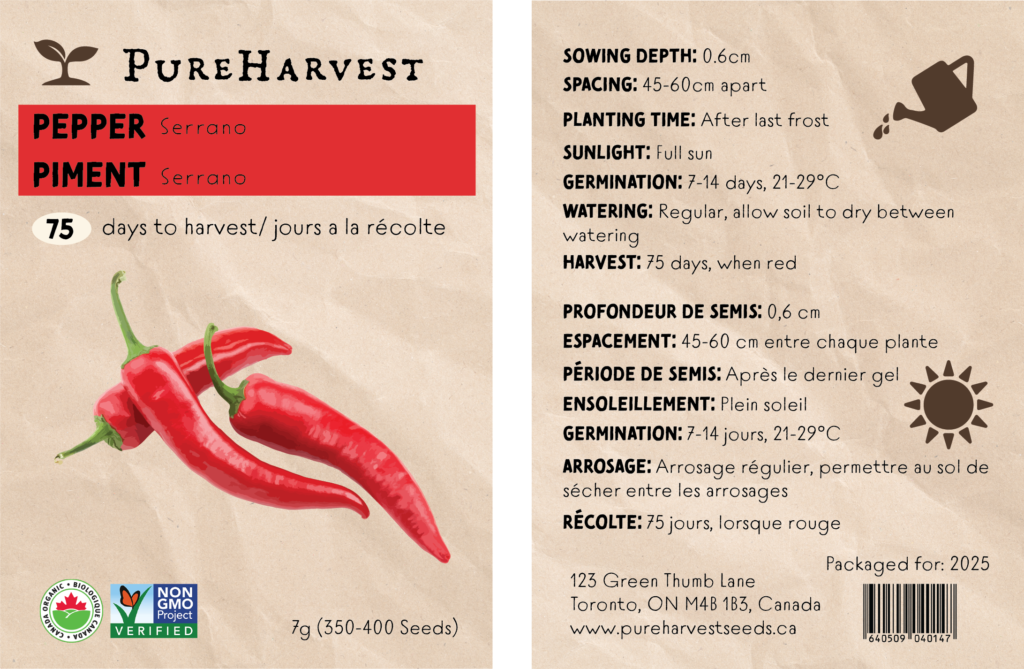
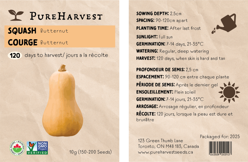
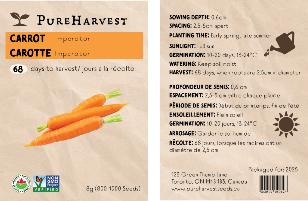
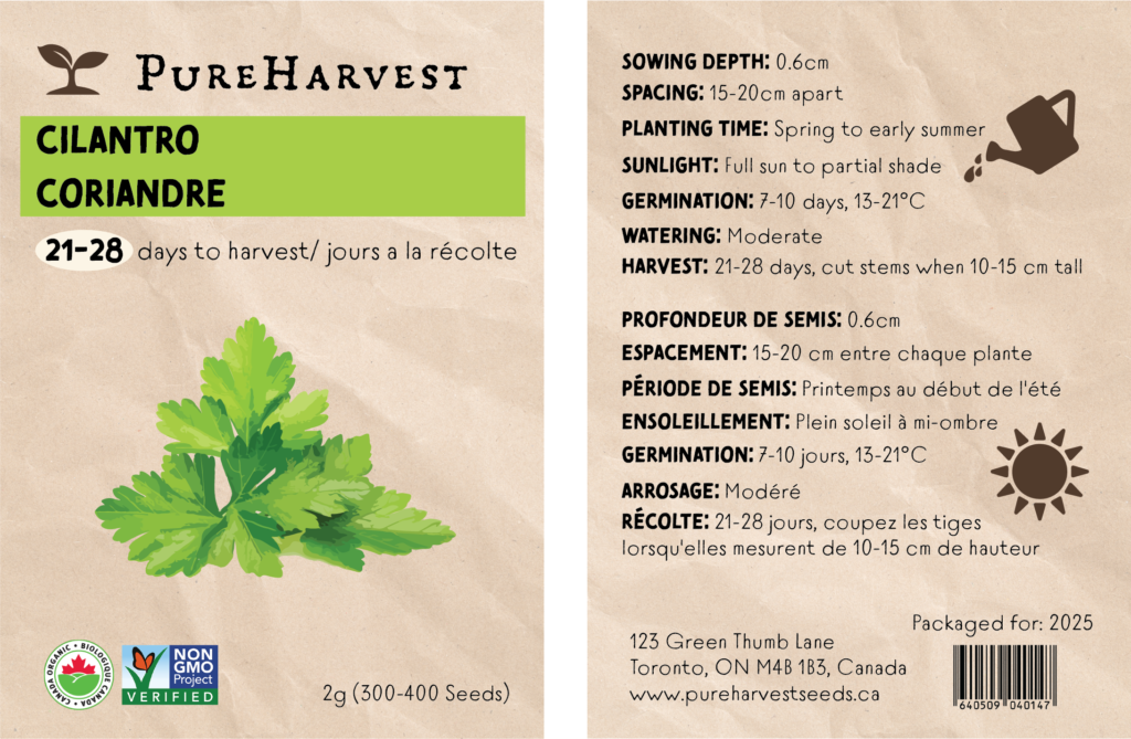
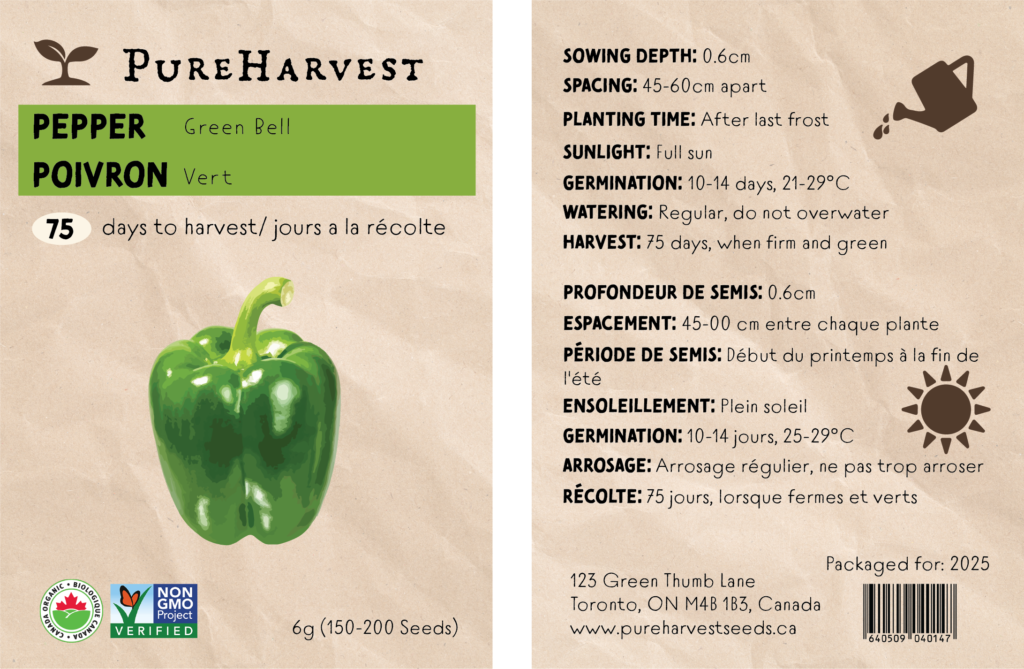
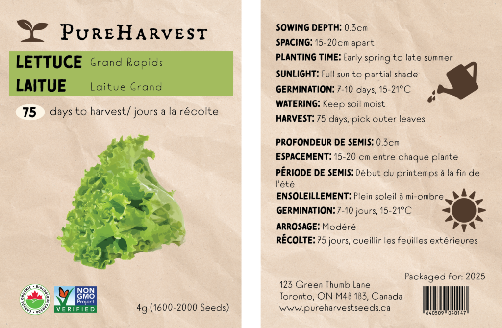
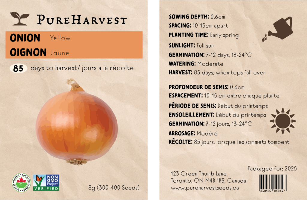
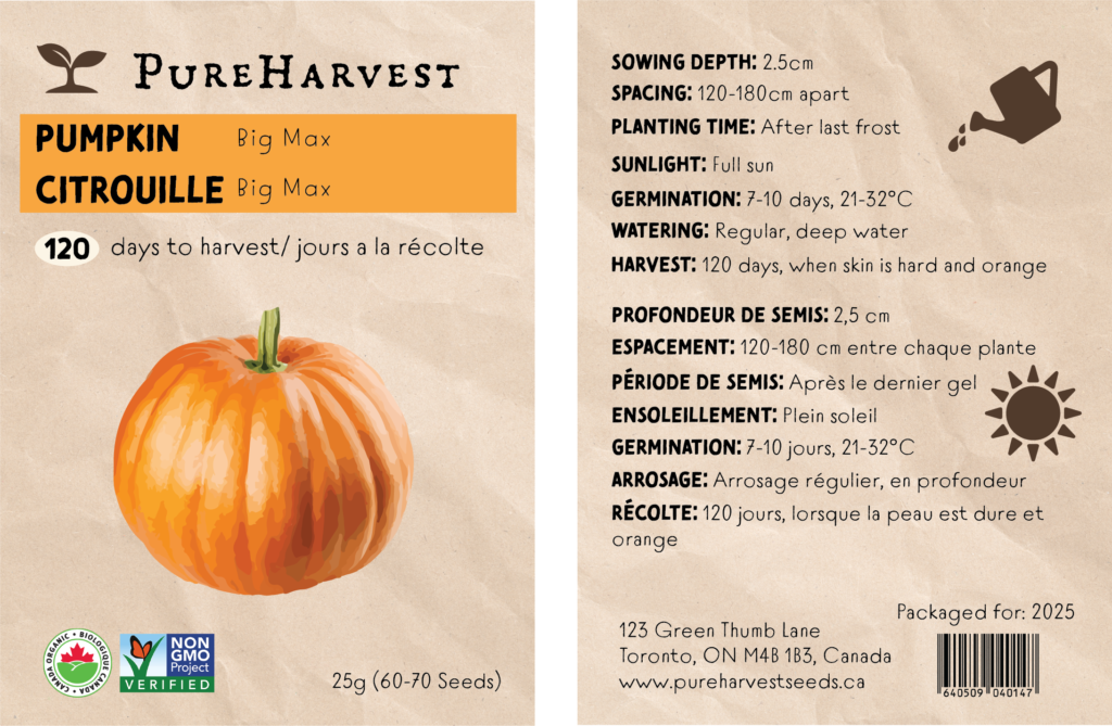
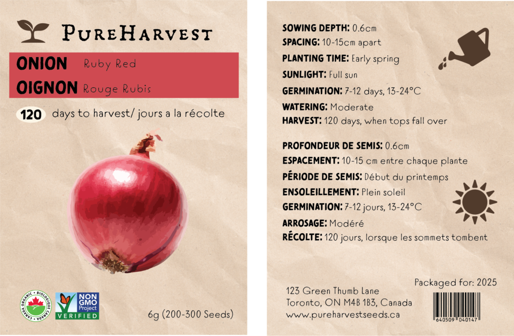
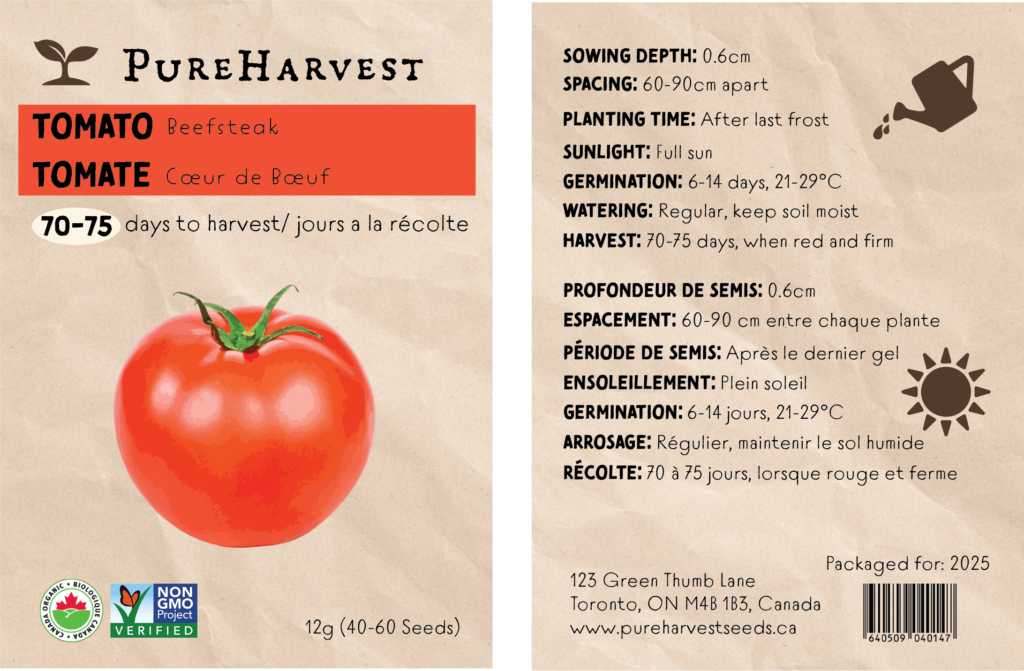
Features distinct packaging for seeds like butternut squash and serrano pepper. Showcases design skills with color coding, clear typography, and realistic produce illustrations. The front highlights the product name, days to harvest, and organic certification. The back includes planting instructions and intuitive icons. Maintains a cohesive brand identity, reinforcing PureHarvest’s commitment to organic, high-quality seeds.
