Social Media.

Ancord Design Sustainability

Features a series of slides highlighting the company’s sustainability commitments and BC Green Business certification. Key initiatives include increasing plastic recycling and reducing landfill waste, implementing a sustainable purchasing policy, and sourcing marine debris plastics through partnerships with Ocean Legacy Foundation. The design integrates authentic team photography, bold infographics, and certification seals to reinforce credibility and transparency. With ocean-inspired colours and Surfrider Foundation Canada’s visual identity, the clean and consistent layout creates an engaging narrative that reflects ANCORD Design’s dedication to environmental responsibility, circular economy innovation, and community impact.

World Ocean Week

Features a series of graphics promoting World Oceans Week and World Oceans Day events, emphasizing reflection, learning, and action for ocean conservation. Key initiatives include raising awareness of ocean health, encouraging community engagement through events, and showcasing career opportunities in marine science, policy, and conservation at an Ocean Career Fair. The design integrates ocean photography, bold typography, and partner organization logos to reinforce credibility and collaboration. With ocean-inspired colours, wave motifs, and consistent layouts, the campaign creates an engaging visual identity that highlights collective responsibility, environmental stewardship, and volunteer opportunities.

ReSurf Launch & Event

Features a series of graphics promoting a community event hosted by Surfrider Foundation Canada in collaboration with ReSurf, focused on creating a sustainable future for surf culture. Key themes include highlighting the environmental impacts of surf gear, introducing ReSurf’s repair, remanufacturing, and recycling initiatives, and inviting community members to engage with industry leaders such as Operations Manager Adam Gilmer. The design integrates authentic surf gear photography, bold and accessible typography, and Surfrider’s recognizable logo to reinforce credibility and partnership. With ocean-inspired branding, clean layouts, and clear calls-to-action, the campaign establishes a strong visual identity that emphasizes sustainability, innovation, and collective responsibility in protecting ocean environments while celebrating local surf culture.

ReSurf Coastline Surf & Sport Event

Features a countdown-style Instagram carousel designed to generate excitement for Surfrider Foundation Canada’s upcoming event with ReSurf. The campaign emphasizes sustainability in surf culture by encouraging community members to attend and learn about gear repair, remanufacturing, and recycling. Key elements include clear event details, bold calls-to-action, and surf photography that visually connects with the audience. Wave-shaped backgrounds, ocean-inspired colors, and clean typography unify the design while reinforcing environmental responsibility, collective action, and community engagement.

Ready, Steady... Balance!

Features a series of informative slides about the new resource. Showcases skills in creating educational content with a clear and organized layout, aligned with the company’s brand identity. The post uses vibrant colours and playful graphics to engage the audience while providing essential information about the balance cards. The design ensures readability and visual appeal, maintaining consistency with Ophea’s branding.

National Social Media Day

Features a series of educational slides on the impact of social media on mental health and body image. Showcases skills in creating informative and engaging content with a clear and organized layout, consistent with Ophea’s brand identity. The post uses a mix of vibrant colours and graphics to capture attention and convey important statistics and resources effectively. The design maintains readability and visual appeal, emphasizing the educational message.

Pride Month Resources

Features a series of educational slides about 2SLGBTQI+ history and resources. Showcases skills in creating informative content with a clear and organized layout that aligns with Ophea’s brand identity. The post uses vibrant colours and engaging graphics to highlight resources for different educational levels, ensuring readability and visual appeal. Each slide provides detailed information and encourages interaction and learning.

Indigenous History Month Resources

Features a series of educational slides highlighting resources to learn about Indigenous history and perspectives. Showcases skills in creating informative content with a clear and organized layout that aligns with Ophea’s brand identity. The post uses vibrant colours and engaging graphics to promote resources for different educational levels, ensuring readability and visual appeal. Each slide provides detailed information and encourages exploration and understanding of Indigenous experiences and histories.

Healthy Schools Certification

Features celebratory slides for the 2022-2023 Healthy Schools Certification. Demonstrates skills in creating engaging, interactive content with a festive layout. Design includes vibrant colours, confetti graphics, and placeholders for user-generated images to boost participation. Each slide highlights different aspects of the certification, ensuring readability and visual appeal. Interactive elements encourage users to share their Healthy Schools team photos and initiatives, fostering community involvement.

Play for All

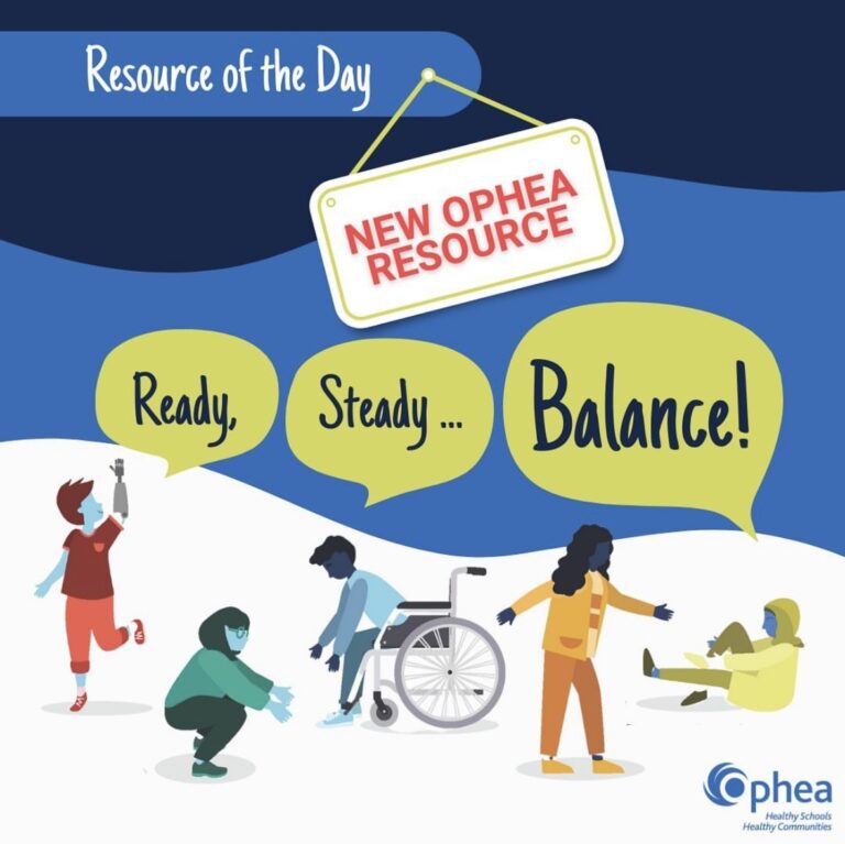
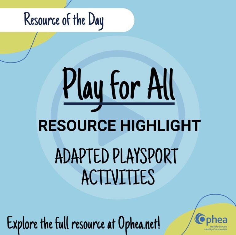
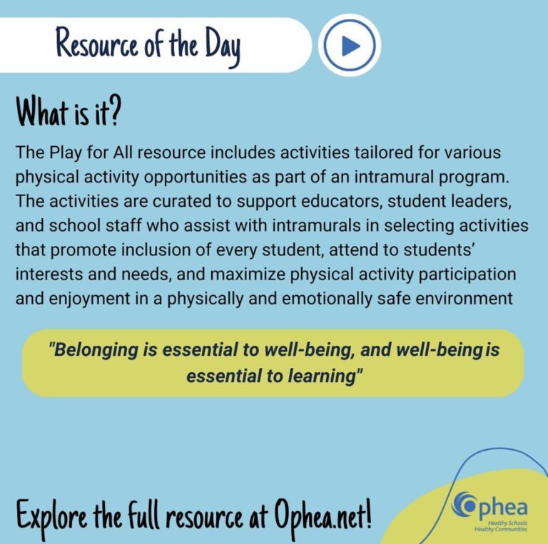
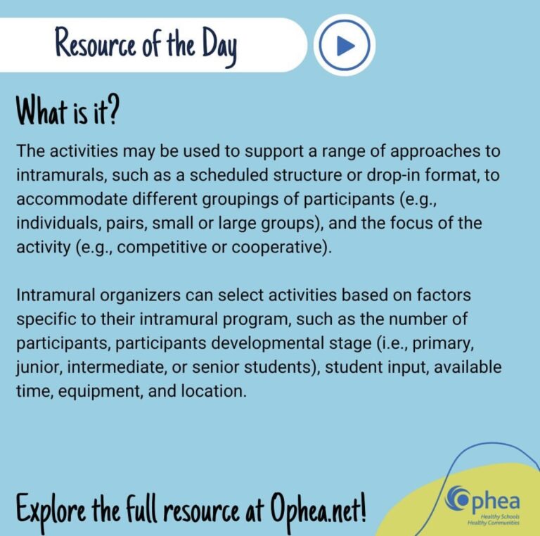
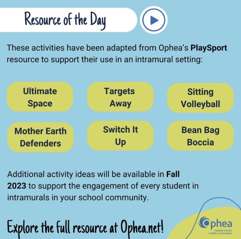
Features vibrant colors, engaging fonts, and clear call-to-actions to showcase adapted PlaySport activities. The design incorporates celebratory elements like confetti graphics and dynamic layouts to capture attention. Each slide provides detailed information on the resource, including its purpose, tailored activities for inclusive physical education, and motivational quotes. The aim is to promote inclusion, maximize physical activity participation, and encourage school community involvement.